A new visual identity for SANA Food: quality, sustainability and new business connections
September 2025
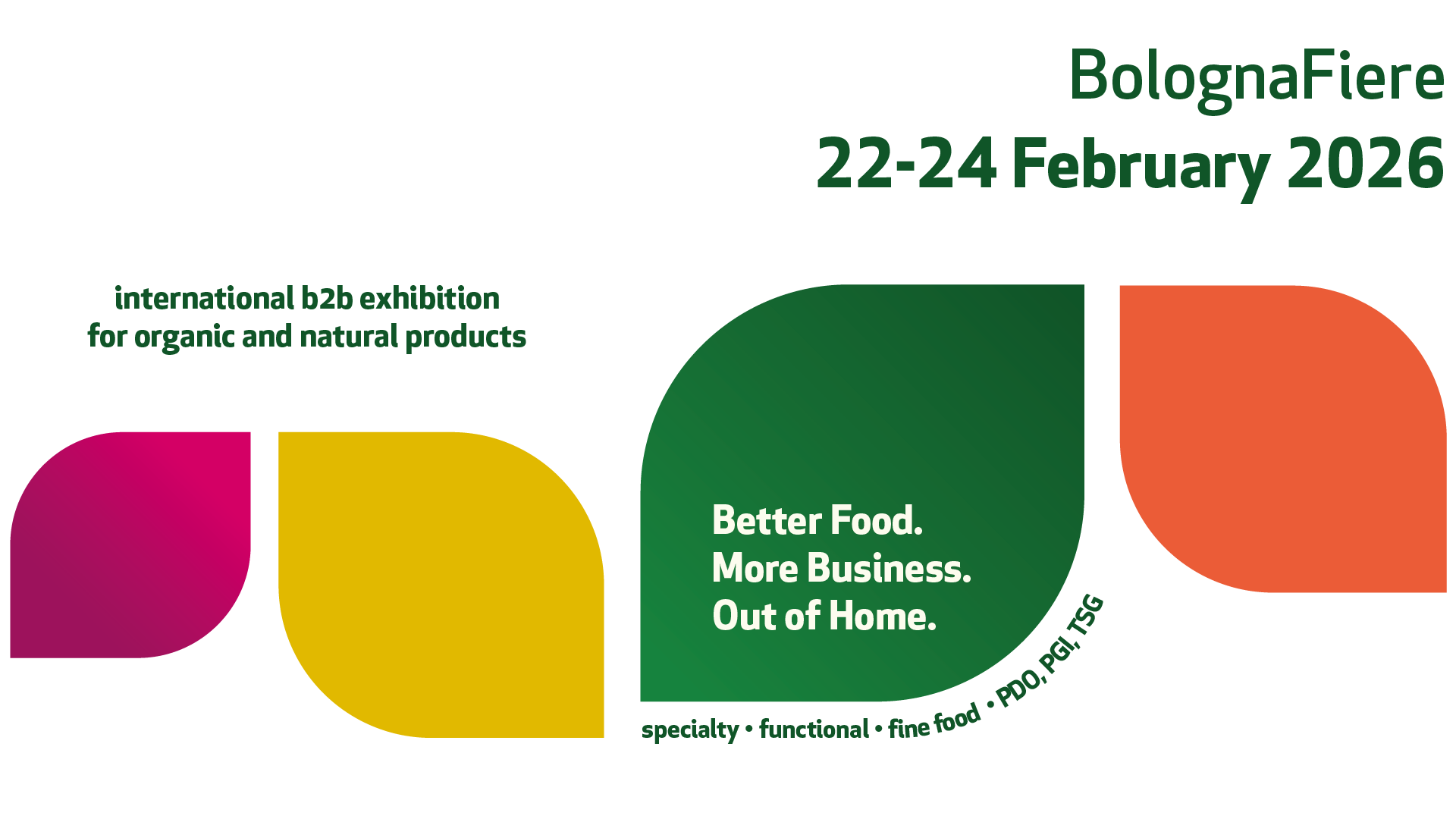
Better Food, More Business, Out-of-Home: the event organised by BolognaFiere at the centre of a network connecting out-of-home professionals and promoting a new food culture.
SANA Food is undergoing a renewal, starting with its visuals. The new visual identity immediately conveys the brand image of the international B2B trade fair for organic and natural products, the BolognaFiere platform where business, culture and values come together to shape the future of out-of-home food.
The focus of the restyling is a deconstructed flower with four petals in fresh, vibrant colours. This visual element was already present in SANA Food's corporate image, but in less vivid tones. In the new colour scheme, the flower aims to strongly emphasise the synergy between SANA Food (the green petal) and Slow Wine Fair (the more wine-coloured petal). The gradual transition from the colours of one event to those of the other conveys the complementary and closely connected nature of the two fairs.
With a single ticket, visitors can access both exhibitions and embark on a unique journey, where food and wine interact in the name of virtuous production methods and the same underlying philosophy. The colour palette also evokes the collaboration with Slow Food Promozione, which will bring Slow Food Presidia and local networks to SANA Food.
Also worthy of note is the upward tension of the petals, starting from the lower ones – with more earthy colours and more closely linked to the roots – to the upper ones, which denote the development and growth of the flower. The same dynamic is affecting the SANA Food network, which is expanding and increasingly in line with the needs of professionals in the Horeca sector, specialised retailers, restaurant-retailers and buyers focused on authenticity and traceable supply chains, intercepting emerging trends in conscious consumption and opening up new commercial channels.
The visual design for SANA Food 2026 was developed by Creostudios, which used dynamic, minimalist language to translate the event's identity into an image that effectively conveys the concepts of energy, networking and growth.